Altered States Part 2 - Idea Sketches (2)
- 20114328
- Jan 13, 2022
- 2 min read
With my character sketches done, I moved on to sketching an idea for the background.
I knew that I wanted a split background (Look at my previous post to see my composition tests), but for quite a while I was unsure of what I wanted the environment to actually be.
One thing I was certain of was that I wanted to sketch the basis for the background once, and adapt it to fit both sides of the final piece. My mind went along the lines of 'keep it simple' and 'stick to what you know', and then it hit me. Every year since 2017 (excluding Covid times of course), I have been to a huge steampunk event in Lincolnshire called The Asylum. It was this event that my love of steampunk originated from, and it's the first place I think of whenever I hear the word steampunk. I don't have many pictures of the area during the event since I would mostly focus on photographing things in the market stalls, but what I do have is access to Google Earth. I went to the location virtually and took a lot of screenshots of the main area I visualise when I think of the event.


Above: The screenshots I took in Google Earth
Of course during the event, the streets are packed with market stalls and people dressed in steampunk-y clothing, but my focus is on the buildings this time around.
After considering each screenshot carefully, I decided on this one below.

Above: The screenshot I chose as my main reference
The building felt like it would lend itself well to the steampunk aesthetic with some slight adaptations (Removing the Visitor Info signs and such), and I felt like I could make it look a bit more worn down and overgrown for the dystopian side of my final piece fairly easily.
To fit my composition better, I decided to flip my reference horizontally, so the perspective of the shot would cause the door to lean the other way.
I very loosely sketched the background so that I could see what I was working with, and I really liked it. It felt like the right balance between simple and complicated, without too much visual clutter, but enough depth to still be interesting.

Above: Initial background sketch
Since I liked the initial sketch, I picked colours straight out of my reference to use as mid-tones, and did a basic flat colour to plot out where each colour group would go.
At this point, I finally felt ready to start on my final piece.
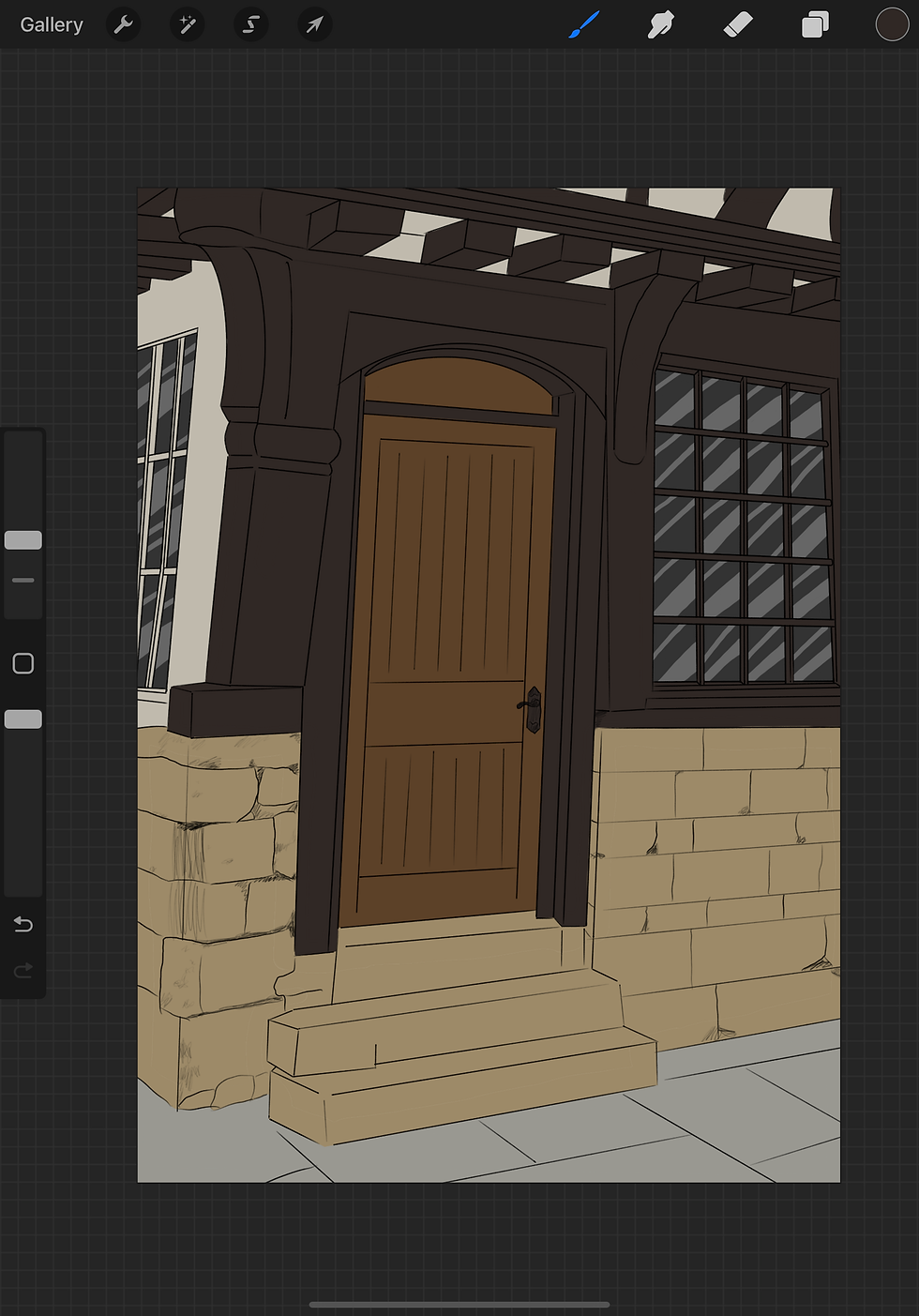
Above: Base background sketch with flat colour


I still like the idea of a doorway between the two realities. Looks great 👍
Inspired research Zoe. I love they way you've done the widows to look like glass. Very clever. 😃