Altered States Part 2 - Idea Sketches (1)
- 20114328
- Jan 12, 2022
- 5 min read
Updated: Mar 8, 2022
With my mood sheets and game research fresh on the mind, I went ahead and started sketching whatever came to me.
The first thing that I decided to do was create some thumbnail sketches in order to decide on composition. Something that I have always struggled with in the past is letting myself consider more than one idea, so I tried my best to come up with as many as I could. I managed to come up with 6 different versions before I ran out of ideas, then I took my sketchbook around to my peers and asked them to vote on which ones they liked best.
As you can see below, the last two that I came up with were the overall favourites, so I was able to rule out the first four entirely.

Above: Thumbnail sketches exploring composition
The sketch on the left wasn't inspired by anything in particular, it just occurred naturally after the previous sketches. The one on the right however was sparked by the left, and I took the design further to make it look more like a playing card.
Personally I like both of these ideas, but I think I will probably go with the one on the left because it allows much more creative freedom than the confines of the playing card format.

Above: The two sketches with the most votes
After the composition sketches, I thought I would just sketch anything that came to mind as a warm up, not necessarily anything that would be useful for the project. However, with my previous research in mind, the simple sketches turned out to be pretty useful in the end.
I didn't use any particular reference or inspiration when sketching these, so I'm thinking I'll just roll with what my brain came up with and modify it to fit later on.

Above: First sketches of character
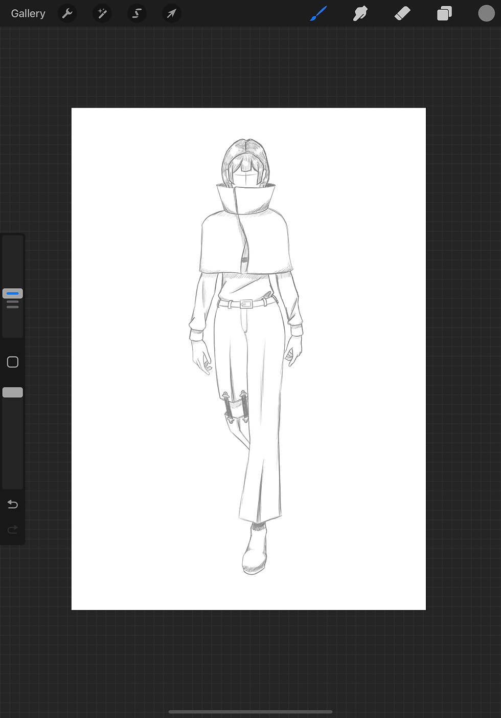
After the surprising success of my warm up sketches, I developed the design a little more. I decided that the high collar I came up with would fit the dystopian side of the piece better, so I'm starting with that. I thought about the sort of world this character would be living in and what sort of hardships she would be facing, and tried to design the rest of her clothing to fit.
I went down a more modern, almost street fashion route for the outfit, with the idea that these clothes likely would have been scavenged from abandoned shops, had likely been damaged in the past, and then repaired with whatever they can find.
I thought about taking the sketch further and adding a background but decided against it, because I wanted to try and make the outfit design a bit more refined first and wouldn't want a background to distract from the initial sketch.

Above: Test sketch for dystopia
I decided that now would be the time to switch over to using digital instead of traditional mediums in order to sketch now that I was nice and warmed up. Overall, I much prefer sketching digitally since I can warp the proportions of what I'm doing quickly in a rapid testing fashion, but warming up does feel more natural in a sketchbook.
I used a sketch I made a while ago of a casual walking pose as a base for my design sketch in order to save time.

Above: Screenshot of sketch base from Procreate
I didn't change very much from that first sketch I made on paper, so this stage was mostly refining my idea. However, I did decide to ditch the bat since it didn't quite sit right with me anymore, and I lengthened her shirt sleeves for the sake of practicality.
Above: Screenshot of dystopia sketch from Procreate
Above: Time-lapse video from Procreate showing how I made my refined dystopia sketch
With the dystopian sketch completed, I went on to design the steampunk look. I used the same base sketch as the previous one because I didn't want to waste time thinking about a pose just yet. I can worry about poses later on when it truly matters.
Funnily enough, the steampunk design didn't come to me quite as easily as the dystopian one, even though I love steampunk so much. I am still unsure as to why this was the case. Either way, I pushed through my foggy brain and came up with the design below.
Something I tried to keep in mind was how plain the dystopian look is- I would need to layer up details and complexity within this look in order to contrast it nicely. I came up with the 'brilliant' idea of adding multiple layers of ruffles to the outfit to add said complexity, and ended up driving myself a little insane drawing them since I hadn't really tried to tackle them before. I need to practice ruffles.
I gave her goggles because they are a staple in steampunk fashion, a high waisted skirt and puffed sleeves for silhouette, and some small bottles that I can add coloured liquid to later. Why bottles? I felt it would be a nice way to add a few small bursts of highly saturated colour to the design to help break it up a little, and it would be a nice lead in to making the character an alchemist. At this point I do not yet know what kind of gameplay or narrative the game would have, but giving this version of the protagonist a profession may help me with that decision later.

Above: Screenshot of steampunk sketch from Procreate
Above: Time-lapse video from Procreate showing how I made my refined steampunk sketch
After finishing those sketches, I moved onto colour. These are not fully rendered because I don't want to spend too long on them. I would much rather have as much time as possible on the final piece.
To colour the sketches, I used a mixture of colouring on a layer below the lines and coloured overlays to blend the lines in.
This is how they turned out.
For the dystopian look, I wanted to try for a balance between the dark and the colourful sides of dystopia that I explored with my mood sheets. I made her hair blonde because I felt it would work well in both designs. I chose mostly desaturated, almost greyscale colours for the majority of the outfit to represent the more grim side of dystopia. I briefly considered purple for the capelet in order to contrast with the hair, but decided against it in favour of a deep red colour. Why red? I am intending to use a lot of bright greens within the environment, so a complimentary red will help her to stand out nicely.

Above: Screenshot of coloured dystopia sketch from Procreate
For the steampunk look, I wanted to make sure I used a lot of golds, coppers, browns and creams. These are staple colours within steampunk, and they aid in the vintage look when the palette is kept cohesive and warm. For the contrasting accent colour within the potion bottles, I couldn't choose just one highly saturated colour, so I used three. I think that these tiny splashes of colour are very eye catching, but they aren't too much and don't overwhelm the design.

Above: Screenshot of coloured steampunk sketch from Procreate
After I finished colouring, I decided I would make life easier for myself by creating a swatch palette with every colour labelled. I can expand on this palette later with more shades, but this is certainly a good enough start for me to get working on the colouring of my final piece when I get to it.

Above: Screenshot of colour palette from Procreate


Absolutely love it. Especially the time lapse videos. I am curious though, how come you started at the feet and went up for dystopia but started with the hair and went down for the steampunk?
Incredible Zoe. Your drawings are brilliant. Looks like you've really got to grips with "Procreate".