Altered States - Working with the Grid
- 20114328
- Dec 2, 2021
- 2 min read
Today's workshop was all about working with layouts with and without the grid.
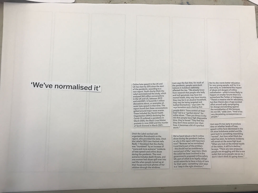
The grid is an often invisible set of columns and or rows used to help organise content on pages for things like magazines. To explore the possibilities of the grid, we were given two types of grid (two column and three column), layout paper (slightly transparent paper to place on top of the grids) and an article on online bullying printed in multiple fonts and sizes (This included titles, pull quotes, body text and a selection of images).
We were asked to take this article and cut it out, then arrange it on the grid in different ways in accordance to the random specifications given every time.
I looked at a few pages from a magazine I buy for inspiration.

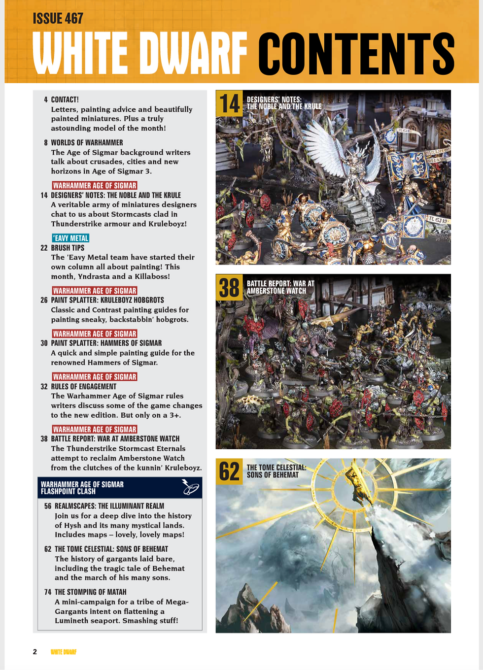
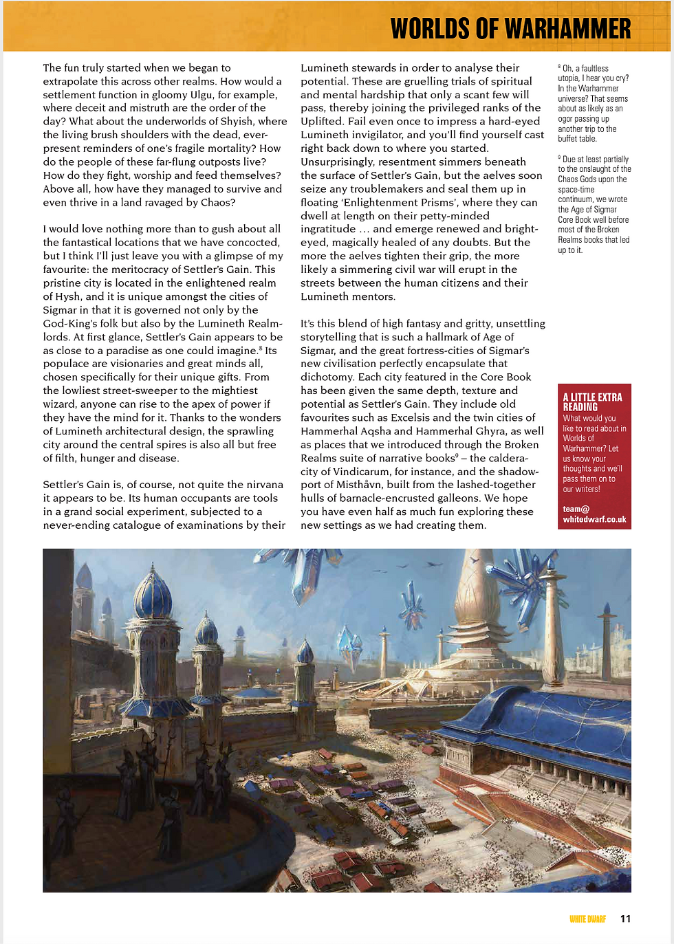
Above 3 images: Pages from issue 467 of White Dwarf
Here are the layouts I made throughout the day.

Above: 1 title, 2 pull quotes, all body text, 1 page

Above: 1 title, 2 pull quotes, all body text, 1 page

Above: 1 title, 2 pull quotes, all body text, 1 page

Above: 1 title, 2 pull quotes, all body text, 2 pages

Above: 1 title, 2 pull quotes, all body text, 2 pages

Above: 1 title, 2 pull quotes, all body text, 2 pages

Above: 1 title, 2 pull quotes, all body text, 2 images, 2 pages

Above: 1 title, 2 pull quotes, all body text, 2 images, 2 pages

Above: 1 pull quote, all body text, 2 pages

Above: 1 pull quote, all body text, 1 page
Above: 1 pull quote, all body text, 2 pages

Above: 1 title, 4 paragraphs, 3 images, 2 pages

Above: 1 title, 4 paragraphs, 3 images, 2 pages

Above: 1 title, 2 pull quotes, all body text, 1 image, 2 pages

Above: 1 title, 2 pull quotes, all body text, 1 image, 2 pages
After spending the whole day arranging text within the grid, we spent a bit of time arranging it outside of the grid. We were asked to create 'text that shows movement' and make something that fits within what Altered States means to us.
I had previously decided that Altered States means 'colour' to me, so I decided to add text to a previous piece, that simply says colour. To add more variation and visual interest, I used the large circle within the image as the first 'O' in colour. To show 'movement', I placed my finger on a random point in the image, and moved my finger in whatever direction came to mind first. I ended up doing a large sweeping motion across the page, so the letters follow that movement.

Above: What I arranged first
I decided to make one slight adjustment, which was turning the U over to show its white paper back, allowing it to show up a little easier.

Above: Final arrangement
I found this workshop quite interesting, since I'd never really explored this aspect of design before. I feel that it may help me in the future when presenting my work.


It's interesting to see how much variety you can achieve with the same text blocks.