The Device Project- The Heart Of Waypoint
- 20114328
- Feb 12, 2021
- 2 min read
With the designs done, it was time to start modelling. I absolutely love working in Fusion 360, I had practiced a lot in my free time since our crash course in the software, so I was more than happy to work on modelling alongside Danny.
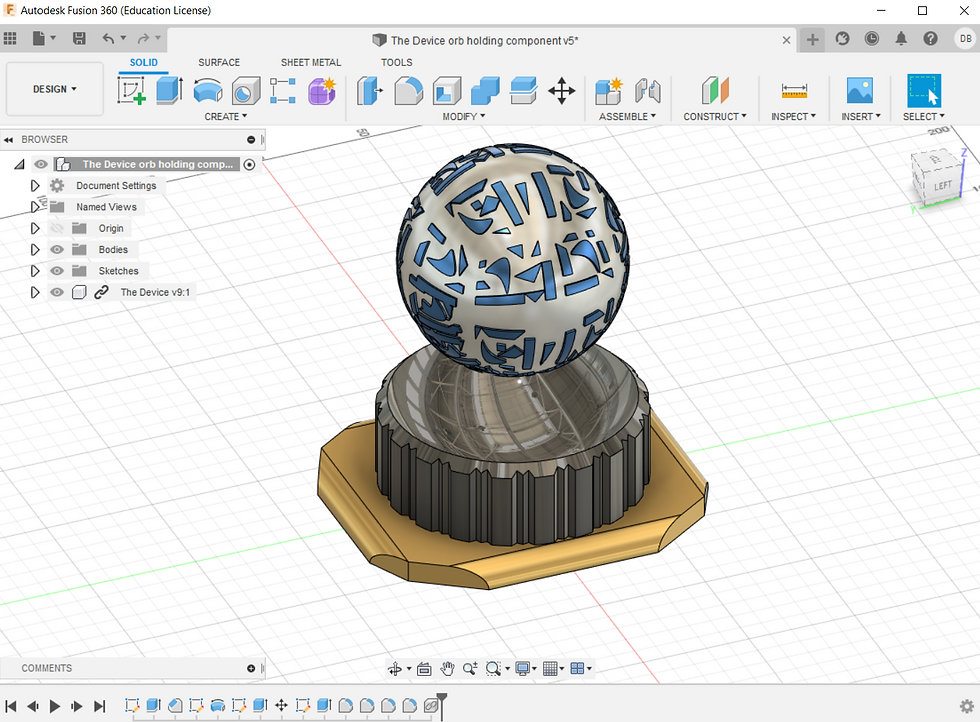
During his free time he decided to get a head start on the modelling, creating this really pretty orb design here. I loved the designs on the orb's surface so much, I thought that they looked like a cross between hieroglyphics and symbols I often see pop up on alien related programs on Sky History. Either way, it felt very fitting for our other-worldly teleportation device.

Not long after he also went ahead and designed a socket for the orb to fit into. This socket would be fixed to the glove by its base.
While he was working on these, he suggested some rings that would revolve around the orb. I absolutely loved this idea- they reminded me of Saturn's rings, which I felt gave some interesting and thematically appropriate imagery to the device. I got to work on designing these rings and more importantly, making them function.

This was my first pass design for the rings. The orb and innermost ring had holes all the way through to allow for some thin elasticated thread to pass through, giving the illusion of the rings floating around the orb. The rings had grooves and pegs within them, allowing for free rotation without falling to pieces. It took 4 separate designs of these pegs and grooves before I was able to print a successful set of rings. I was certainly glad for the 3D Printer at home during this stage.

During the time period where I repeatedly redesigned the rings for functionality, Danny took some of the group's ideas into account and redesigned the orb until we were all satisfied with the more modern look. While hieroglyphics were a fascinating concept, this would be far more recognisable.

When everyone was happy with the aesthetics and functionality of the different pieces, we merged them all together to see where we stood. The modelling was finished and ready for printing.


With the model complete, Danny and I discussed some colour schemes for it. With the colours chosen, I rotated the rings virtually and sent him the file so that he could produce these beautiful renders. All of these colours would be available to future customers, since modern society likes to be able to customise everything they own.

Smoke Grey

Mars Black

Scarlet Red

Royal Blue

Emerald Green
When it came to production of the prototype later, we collectively decided to make the Scarlet Red option because it went well with our monochrome theme- black, white and red is very eye-catching. The red one wasn't my favourite, but I always have been partial to Royal Blue in general.

A brilliant set of renders, the fusion work is amazing and the idea of the revolving rings looks great.